
We build, scale & optimize high-performing e-commerce stores.

All projects Shopify Case Study

Lushfairy

We rebuilt the Lushfairy storefront from a dated, hard-to-shop catalogue into a conversion-focused (CRO) Shopify experience that guides shoppers from inspiration to checkout in fewer steps.

Visit Live Site
Platform
Shopify
Website
lushfairy.in
lushfairy.in
Lushfairy — Shopify store
01 The Challenge

What the client needed

Lushfairy had strong handcrafted products and good photography, but the old UI buried them and made buying feel like work. Traffic was arriving; too little of it was converting.

  • No clear first impression. The homepage did not say what the brand sells or why it is special within the first screen.
  • Weak navigation. Collections were hard to find, with no clear split between suits, sarees and lehengas.
  • Offers were invisible. Bundle discounts and prepaid benefits existed but shoppers rarely saw them before checkout.
  • Low trust signals. Ratings, secure payment, returns and shipping promises were missing or hidden in the footer.
  • Friction on product cards. Shoppers had to open every product page to see the price, discount or add it to the bag.
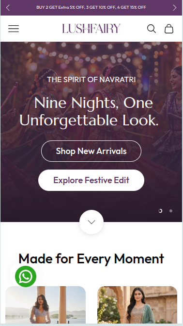
  • Poor mobile experience. Most traffic is on mobile, yet layouts, tap targets and image loading were built for desktop.
02 Our Solution

What we built

The brief was simple: keep the luxury, festive feel of the brand, but make every screen push the shopper one step closer to checkout.

Goals

  1. Raise the conversion rate and average order value (AOV).
  2. Cut bounce on the homepage and collection pages.
  3. Get more customers to pay online instead of cash on delivery.
  4. Make the mobile experience as good as desktop.

How we worked

  1. Audit. Reviewed the old site page by page, plus analytics and heatmap behaviour, to find where shoppers dropped off.
  2. Prioritise. Ranked fixes by impact and effort, starting with the homepage, product cards and cart.
  3. Design. Built a mobile-first layout around one rule: offer, trust and the next action visible on every screen.
  4. Build and test. Developed on Shopify with reusable sections so the team can run campaigns without a developer.

The redesign, section by section

Each section of the new storefront has one job in the buying journey.

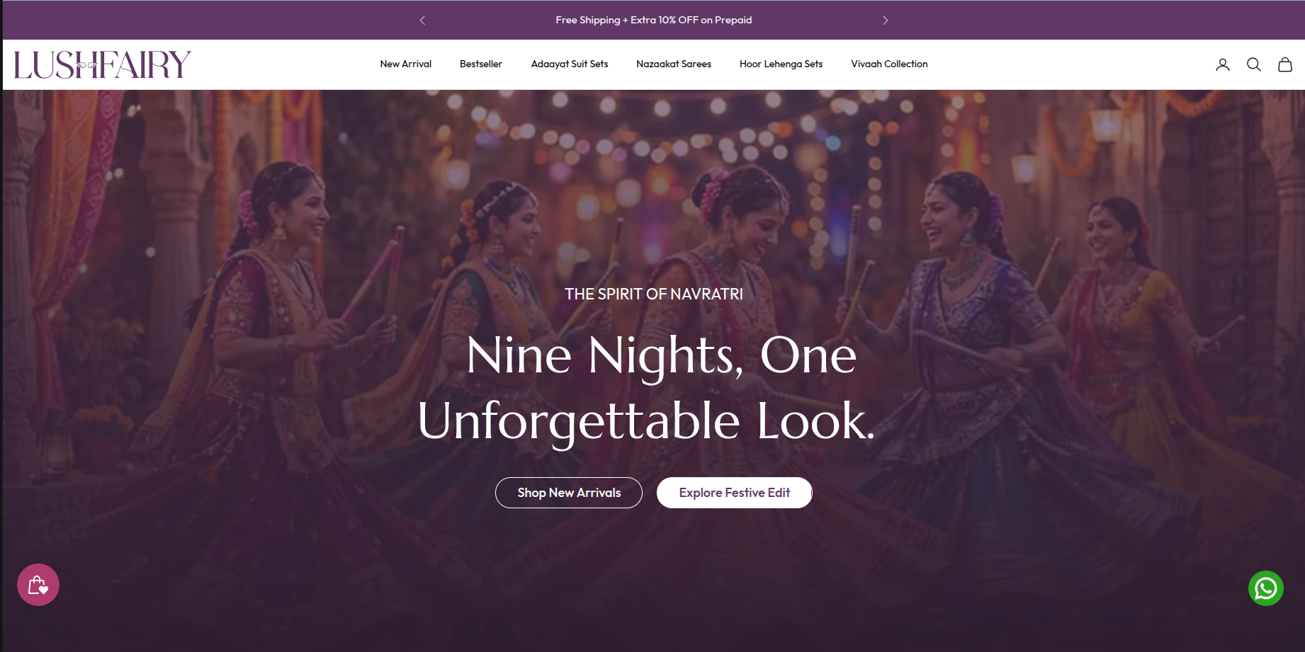
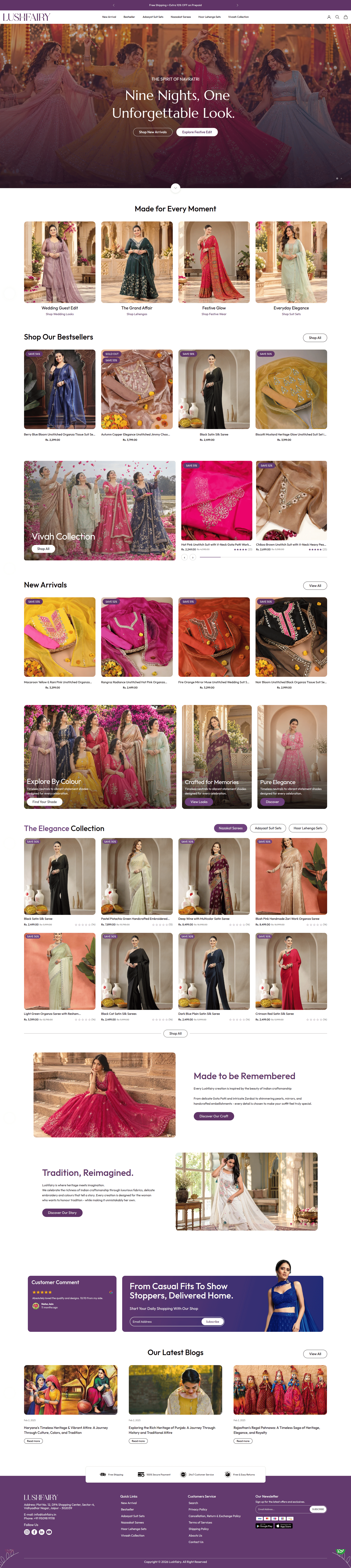
  1. Offer bar at the very top. A rotating bar shows the bundle deal (Buy 2 get extra 5% off, 3 get 10%, 4 get 15%) and "Free shipping + extra 10% off on prepaid". Shoppers see the reason to buy more, and to pay online, before they scroll. CRO lever: AOV and prepaid share.
  2. Clean, collection-led navigation. The menu now maps to how customers shop: New Arrival, Bestseller, Adaayat Suit Sets, Nazaakat Sarees (Cocktail, Ruhaani, Noor), Hoor Lehenga Sets and the Vivaah wedding edit. CRO lever: faster product discovery.
  3. Seasonal hero with two clear CTAs. A full-width campaign banner (for example "The Spirit of Navratri") with "Shop New Arrivals" and "Explore Festive Edit". The banner is swapped per festival without code. CRO lever: relevance and click-through.
  4. Shop by occasion. "Made for Every Moment" tiles (Everyday Elegance, Festive Glow, Wedding Guest Edit, The Grand Affair) let shoppers start from their need, not a product type. CRO lever: intent-based entry points.
  5. Conversion-ready product cards. Every card shows sale price, MRP struck through, a "% OFF" badge, a hover image, star ratings with review count and an "Add to Bag" button. Shoppers can buy straight from the homepage. CRO lever: fewer clicks to cart.
  6. Bestsellers and New Arrivals rails. Social proof first, freshness second, each with a "View all" link into the collection. CRO lever: social proof.
  7. Tabbed Elegance Collection. One block with tabs for Sarees, Suit Sets and Lehenga Sets keeps the homepage short while showing the full range. CRO lever: less scrolling, more browsing.
  8. Brand story and craft. "Made to be Remembered" and "Tradition, Reimagined" explain the Gota Patti, Zardozi and pearl handwork that justify the price. CRO lever: perceived value.
  9. Cart drawer with a delivery promise. The slide-out bag shows an "Order shipped by" date so shoppers know when it will arrive. CRO lever: urgency and checkout confidence.
  10. Trust strip, WhatsApp and footer. Free Shipping, 100% Secure Payment, 24x7 Customer Service and Free & Easy Returns sit above the footer. A floating WhatsApp button, full address, phone, policies and app store links close the remaining doubts. CRO lever: trust and support.

Mobile first throughout. Larger tap targets, a sticky header, swipeable rails and lazy-loaded images keep the store fast and easy to use on phones.

The Outcome

Results

  • Fill these in from Shopify Analytics and GA4, comparing the same period length before and after launch (for example 30 d
Gallery

Inside the Project

More Work

Related Projects

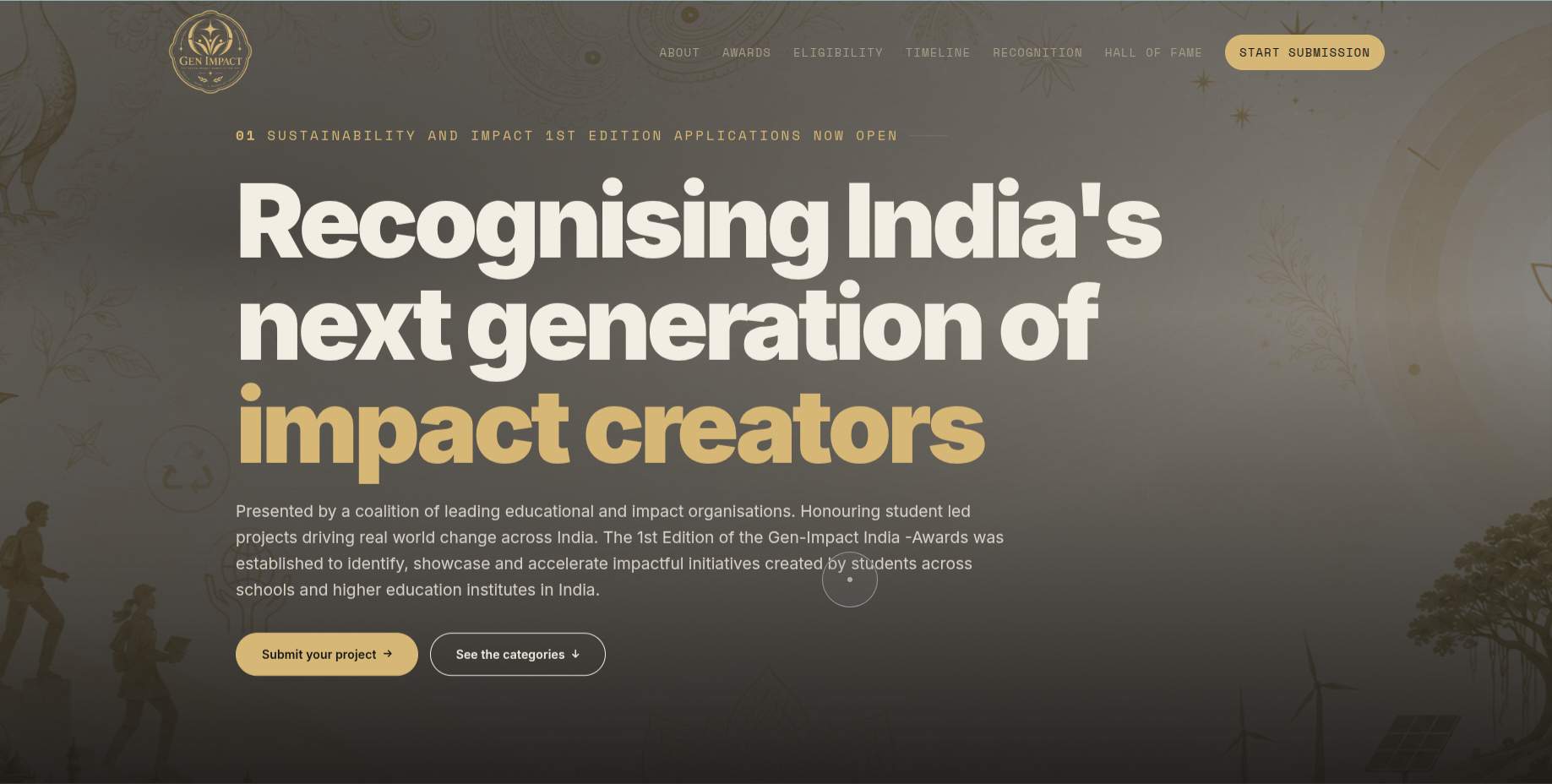
Gen-Impact India Awards: Custom Website Development

We designed and hand-coded the official website for the Gen-Impact India Awards, a national programme recognising student-led sustainability and impact projects. The site explains the awards, judging and eligibility, and takes complete applications online.

  • The programme launched on schedule with one place to explain the awards and collect every type of entry.

Planning a Shopify Project?

Tell us what you're building — we'll reply within 24 hours with how we'd approach it.

Contact Us